
Users don’t care about your org chart
Like a lot of large organizations, the product teams at Olympus have a tendency to develop features in siloes, without necessarily considering how the bigger picture impacts users.
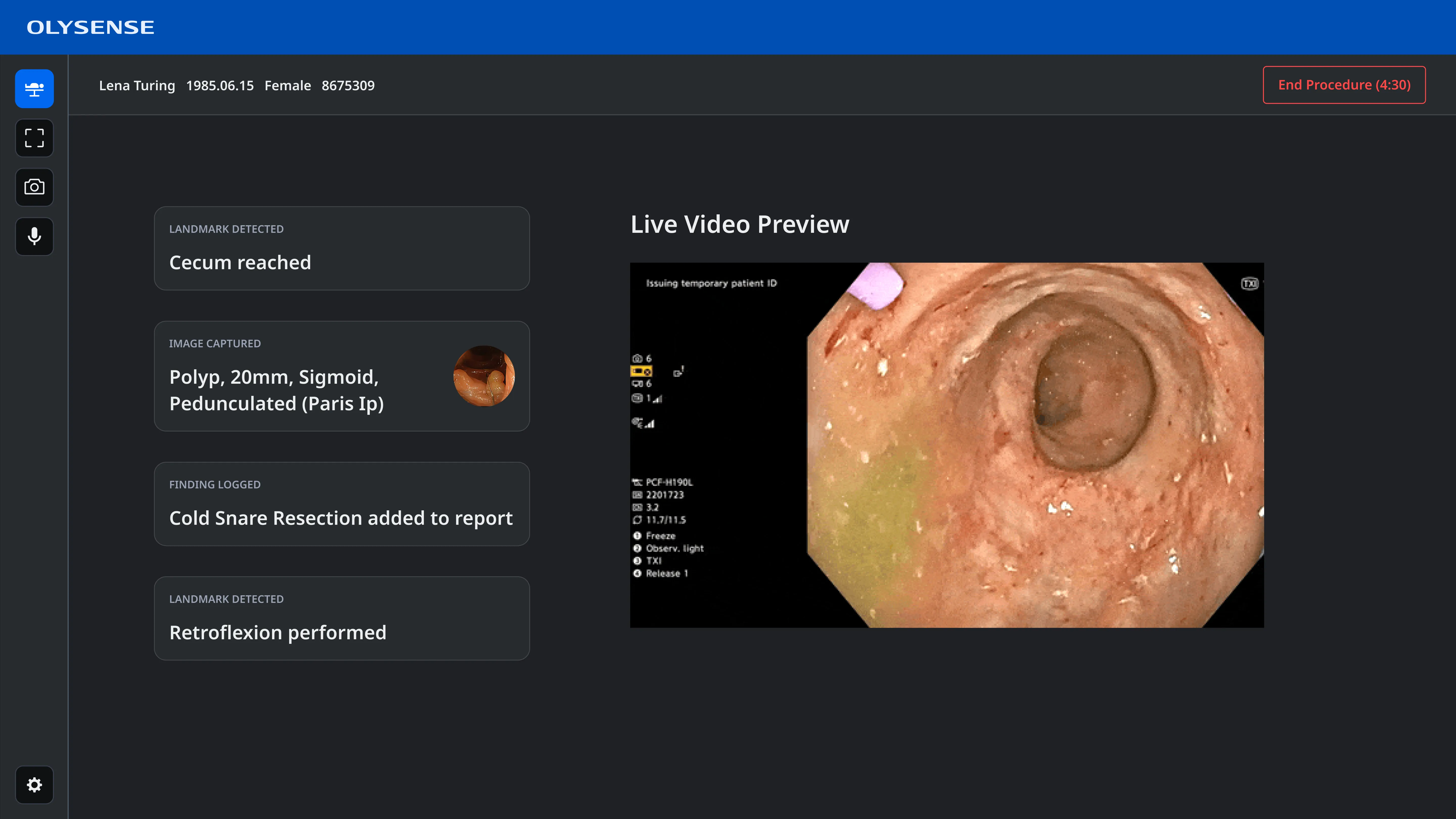
This was particularly apparent in the design for the digital hub, a specialized computer that integrates into the equipment tower in the endoscopy suite and runs the software that doctors use during their procedures.
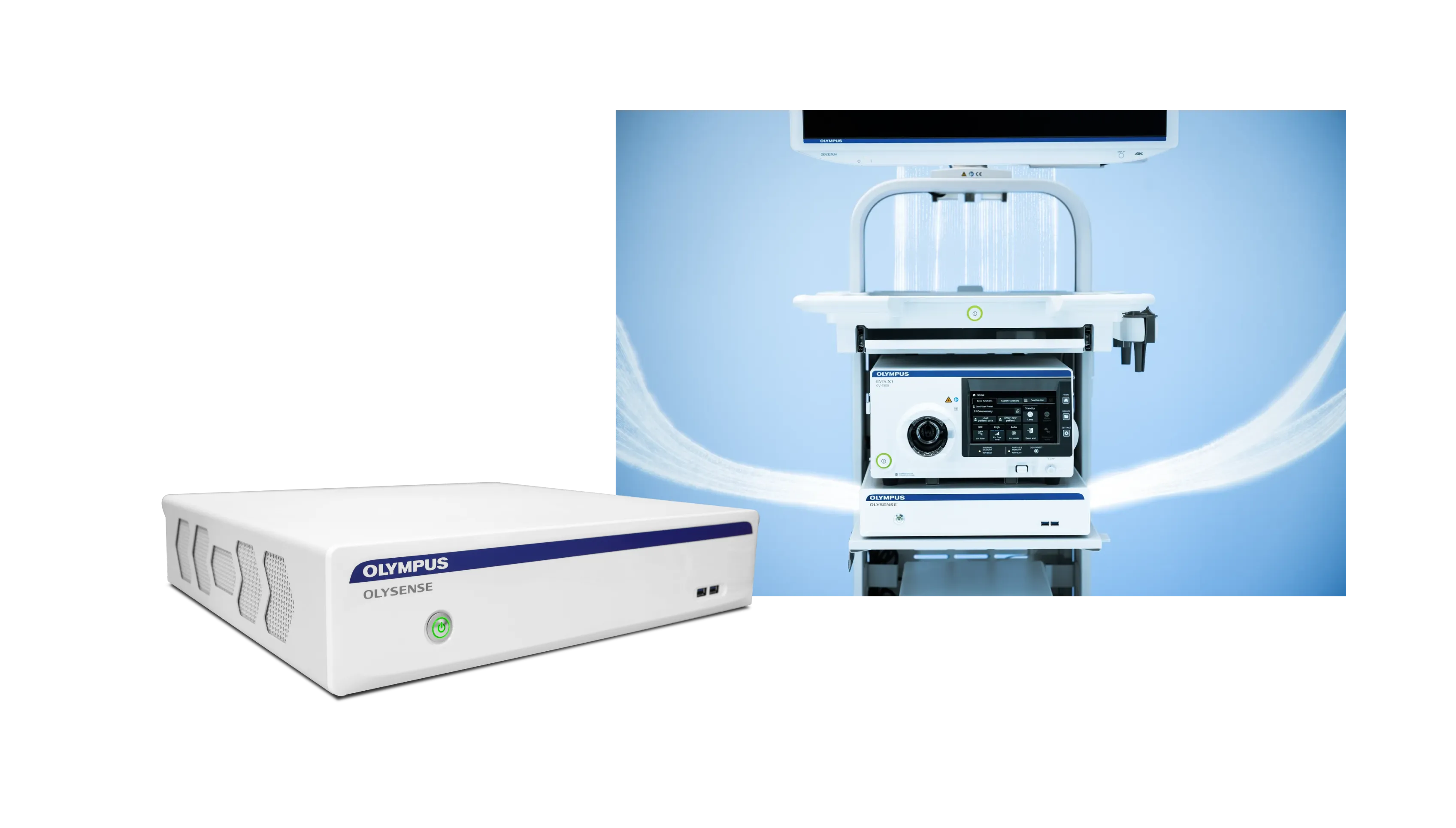
The digital hub was initially intended to run computer aided detection software, which uses AI to help identify potential anomalies.
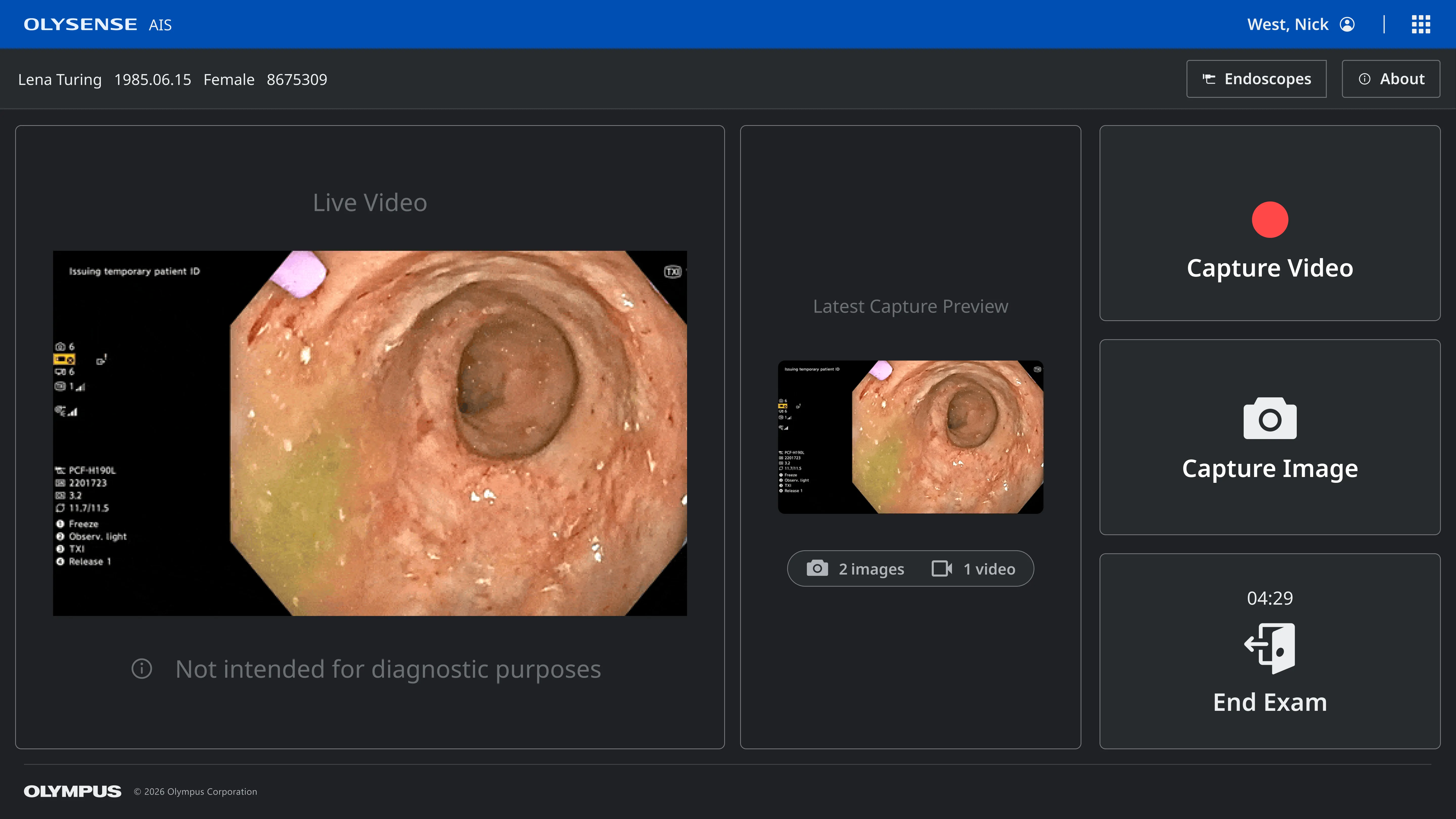
Then our automated imaging solutions team added a separate application to manage capturing images and videos during a procedure.
Later the voice team needed to integrate with the digital hub to run the software that would allow endoscopists to to capture findings verbally.
There were also other teams that would potentially be adding additional apps.
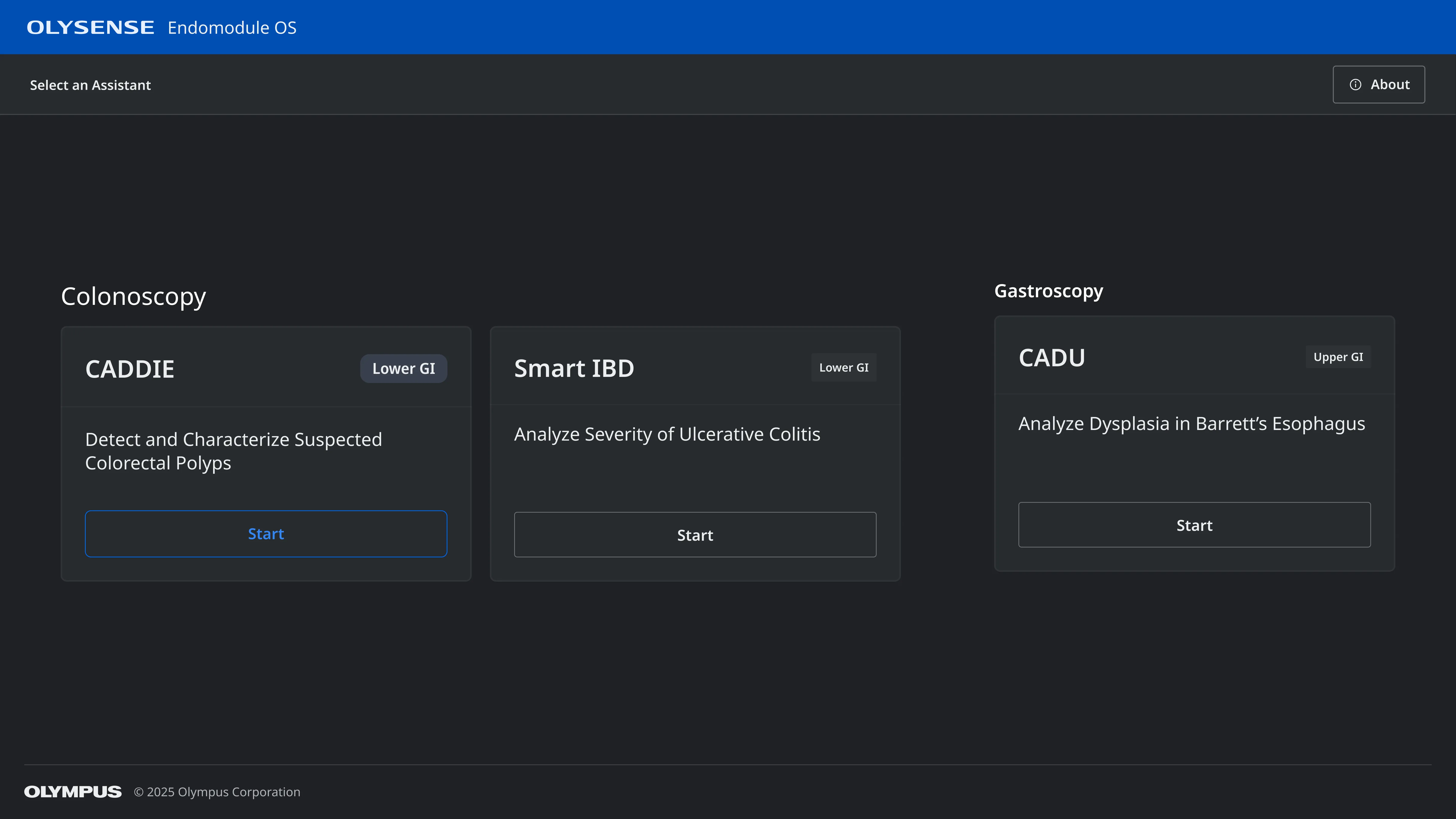
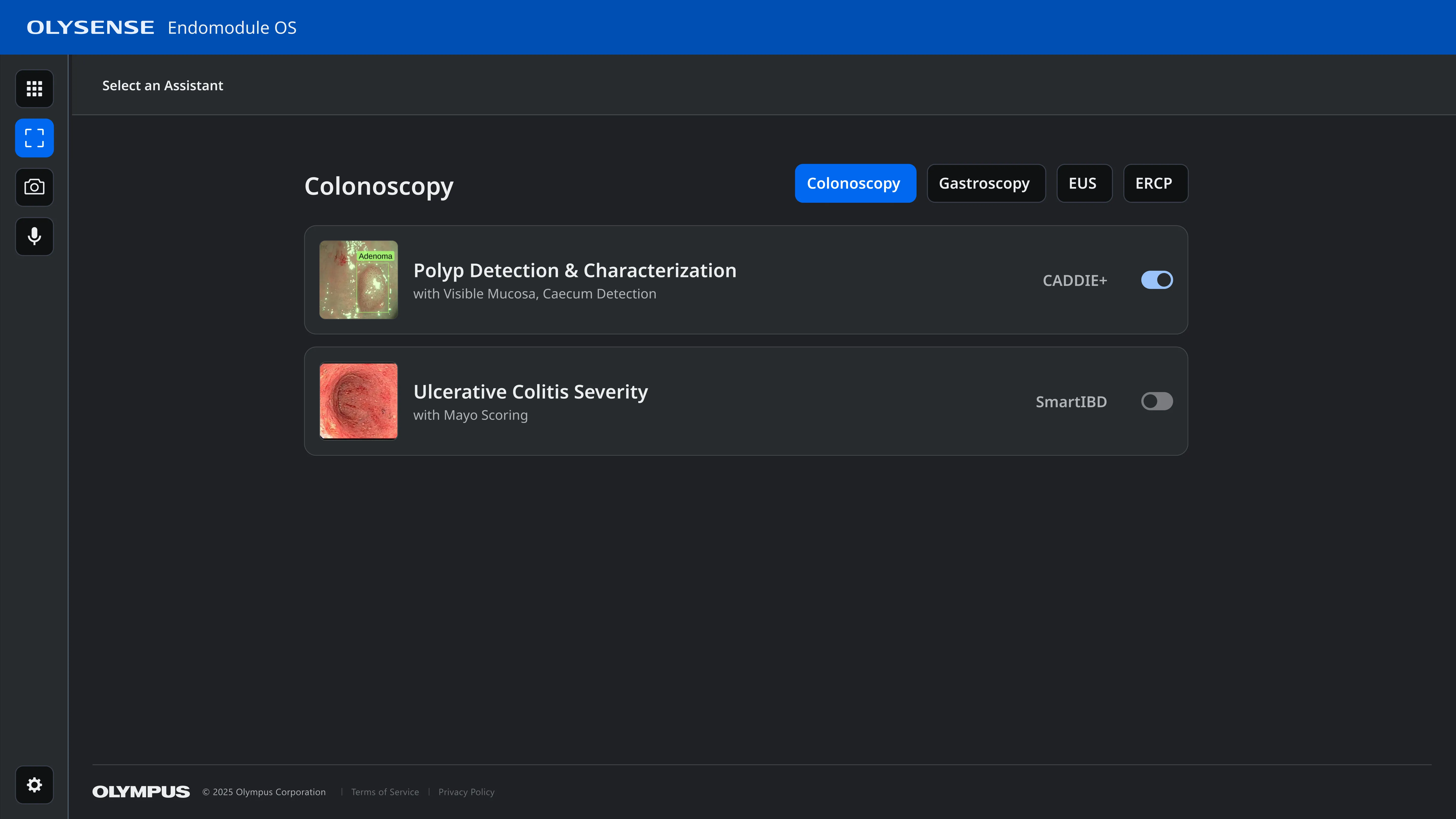
Three applications with entirely separate user flows
Each of these teams were developing these features in isolation, as well as partnering with separate outside vendors.
Each was added as a separate application, with its own login flow and settings, rather than as a unified product suite, meaning users had to log in three separate times to start a procedure. Switching between apps required exiting all the way out of their current application.
Working across teams to create a user-centered workflow
I collaborated with the designers and product managers from each team to understand the needs of their applications and began working on a user flow to remove redundancy and improve the interoperability of the different applications.
I started by mapping the existing experience, to highlight the pain points and get buy-in from senior leadership to address these issues.
Initial Workflow:
Procedure prep: 18 steps, 11 navigation changes
Active procedure: 16 steps, 5 navigation changes
Procedure wrap-up: 8 steps, 4 navigation changes

Next I created a flow demonstrating how the user experience could be drastically improved simply by rethinking the authentication experience and improving the navigation between applications.
Updated Workflow:
Procedure prep: 10 steps, 7 navigation changes
Active procedure: 2 steps, 0 navigation changes
Procedure wrap-up: 2 steps, 1 navigation changes

Finally, I put together a long term vision in which authentication is further simplified by allowing doctors to log in by scanning their ID badge and the system defaults to the appropriate settings based on the procedure type so the staff just needs to confirm it’s correct, rather than configuring it manually.
This workflow has 78% fewer steps than the existing one.
Ideal Workflow:
Procedure prep: 7 steps, 3 navigation changes
Active procedure: 2 steps, 0 navigation changes
Procedure wrap-up: 0 steps, 0 navigation changes

Design updates for the improved workflow
The proposed solution presents default selections for confirmation, rather than manual configuration.
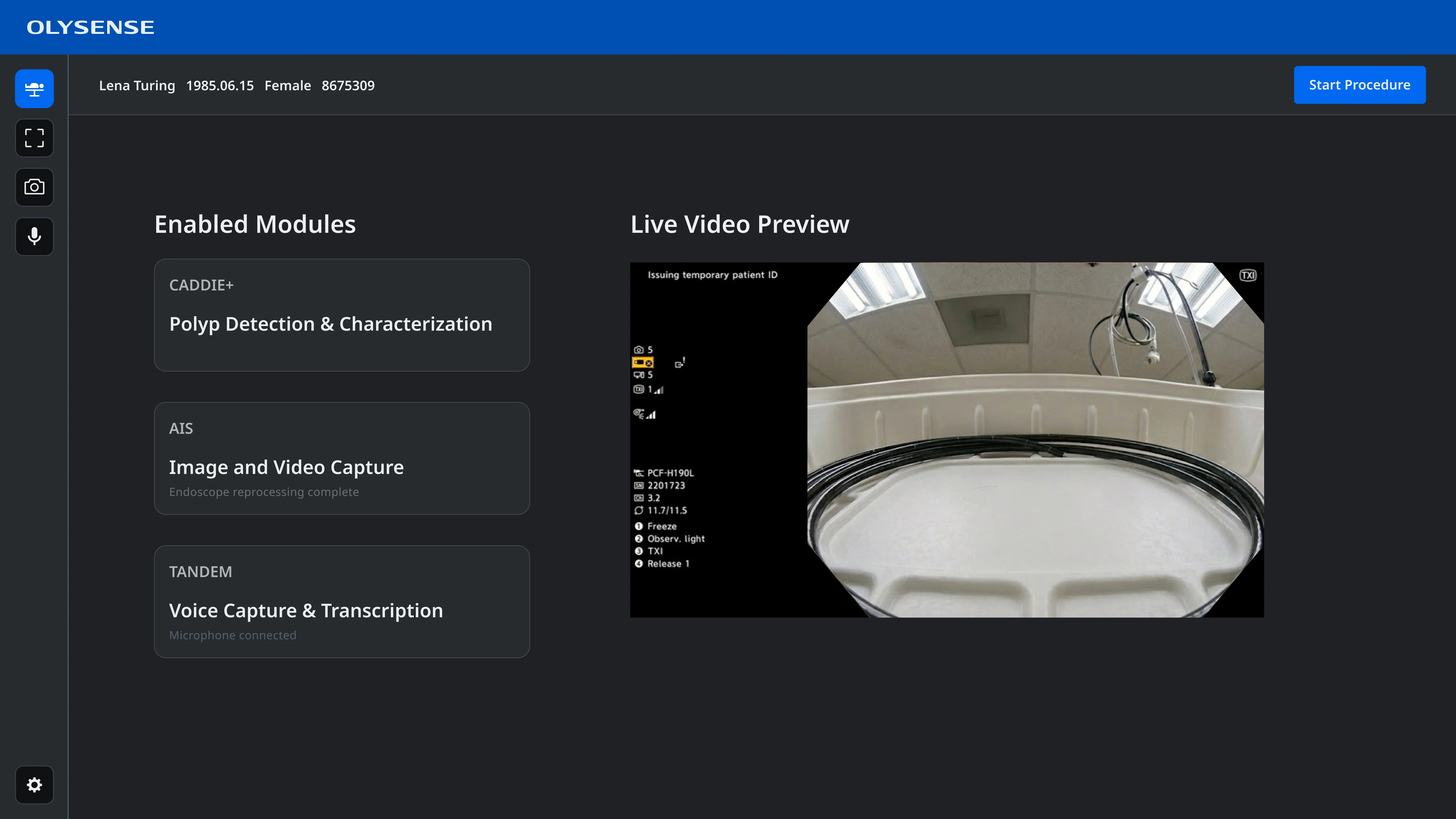
Settings can be configured for individual applications, with a global settings option for shared settings.
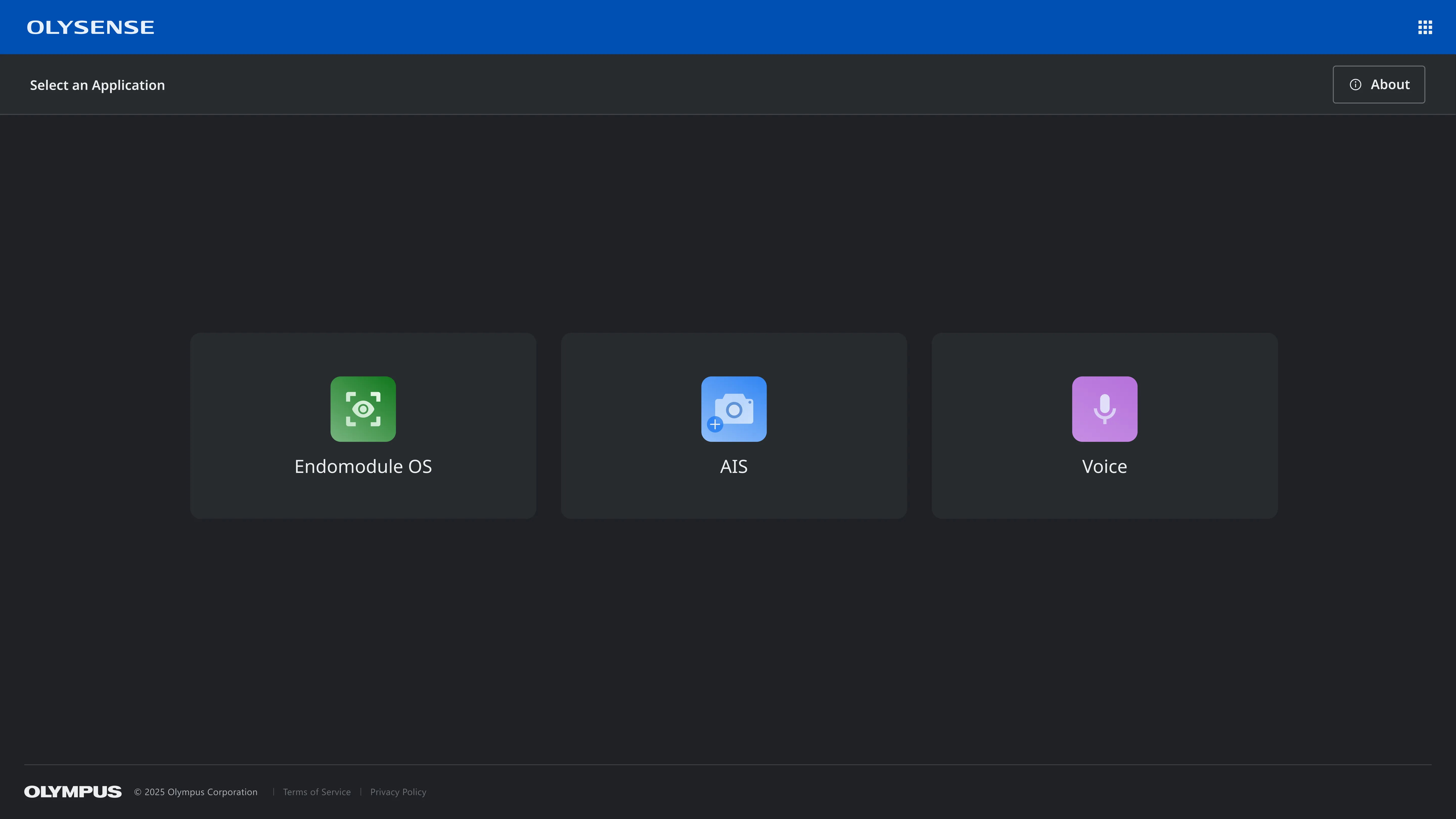
A new sidebar lowers the burden of switching between applications.
A lack of ownership meant appealing to senior product leadership
Once I had a workflow that met the needs of each team without sacrificing the user experience, I worked with design leadership to put together a presentation for senior product leadership.
Due to our tight delivery deadlines we knew these changes would be out of scope for our current release. However, these user flows really helped to illustrate to key stakeholders just how bad the current experience is and we were able to get sign off to pursue a more coordinated and unified experience for subsequent software releases.